Plotting with FastF1 Circuit Information
Source:vignettes/plotting-turn-info.Rmd
plotting-turn-info.RmdIntroduction
This vignette provides a few demonstrations of the use of FastF1 circuit data in generating plots.
We’ll load all the required libraries for our data analysis:
Telemetry Plotting
As in our Introduction vignette, we’ll start by working with telemetry data.
lec <- load_driver_telemetry(2022, 1, "Q", driver = "LEC", laps = "fastest")
ham <- load_driver_telemetry(2022, 1, "Q", driver = "HAM", laps = "fastest")
per <- load_driver_telemetry(2022, 1, "Q", driver = "PER", laps = "fastest")

telem <- bind_rows(lec, ham, per) %>%
  select(rpm, speed, n_gear, throttle, brake, drs, distance, time, driver_code) %>%
  mutate(drs = ifelse(drs == 12, 1, 0))

drivercolours <- c(
  "LEC" = get_driver_color("LEC", 2022, 1),
  "HAM" = get_driver_color("HAM", 2022, 1),
  "PER" = get_driver_color("PER", 2022, 1)
)
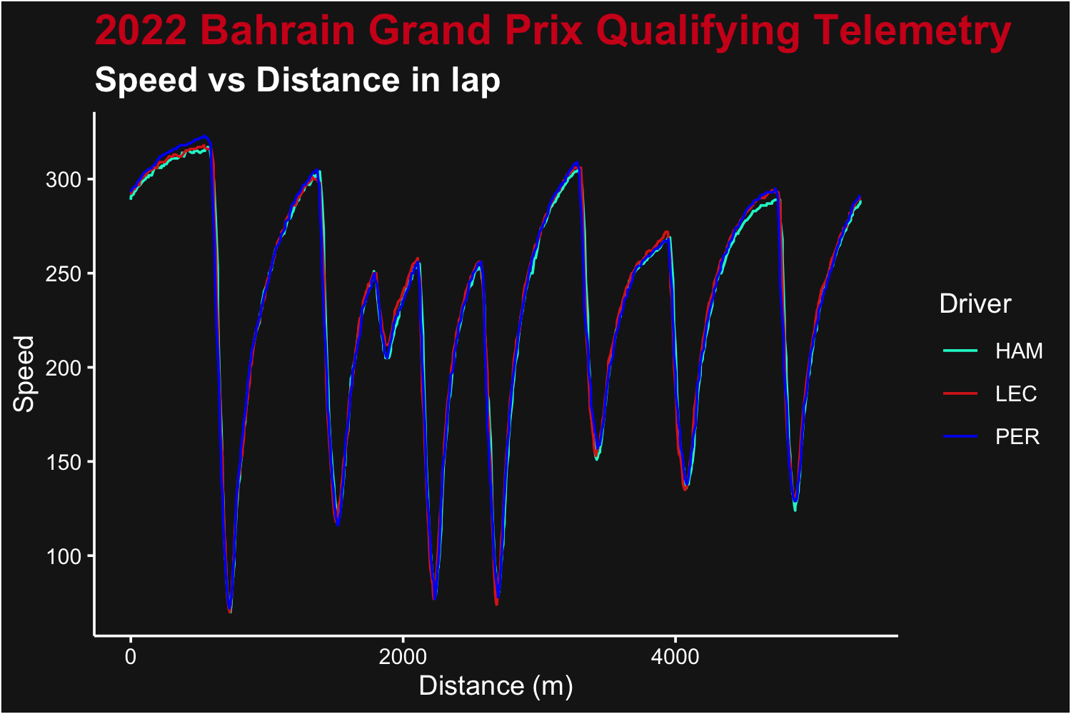
To demonstrate the addition of turn information, we’ll start by plotting the speed telemetry for the three drivers
telem_plot_speed <- ggplot(telem, aes(x = distance, y = speed, color = driver_code)) +
  geom_path() +
  scale_color_manual(values = drivercolours) +
  theme_dark_f1(axis_marks = TRUE) +
  ggtitle("2022 Bahrain Grand Prix Qualifying Telemetry", subtitle = "Speed vs Distance in lap") +
  xlab("Distance (m)") +
  ylab("Speed") +
  labs(color = "Driver")

telem_plot_speed
Speed by Distance for Leclerc, Hamilton and Perez after qualifying best laps
Now, to add the corner numbers to a plot like this, we’ll have to retrieve those from FastF1.
bahrain_circuit <- load_circuit_details(2022, 1)
bahrain_corners <- bahrain_circuit$corners

speedmax <- max(telem$speed, na.rm = TRUE)
speedmin <- min(telem$speed, na.rm = TRUE)
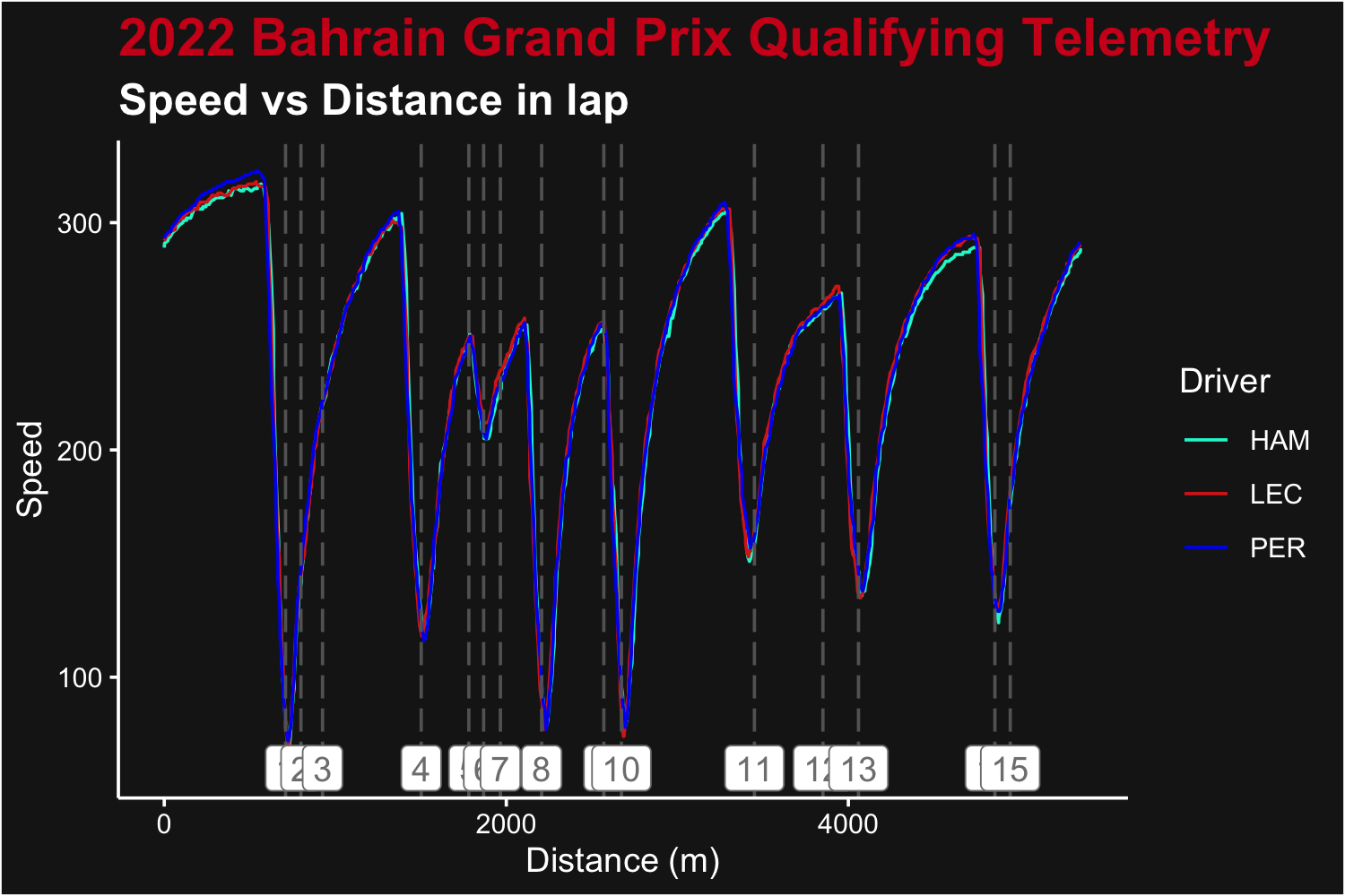
Now we can add these indicators to the previous plot:
telem_plot_speed +
  geom_vline(xintercept = bahrain_corners$distance, linetype = "longdash", color = "#646464") +
  geom_label(data = bahrain_corners, aes(
    label = paste0(number, letter),
    y = speedmin - 10,
    x = distance,
    color = "#9A9A9A"
  ), show.legend = FALSE)
Speed by distance plot as above, but with turn numbres added
Of course, these labels overlap slightly for turns close together
(1-3, 5-7, 9-10, 14-15). Other packages such as ggrepel can
handle these situations better, but are not the point of this
demonstration.
Plotting Turn Number On Track
Similar to the plotting of turn numbers on telemetry, we can add these annotations to the typical track plot.
We’ll work with 2022 Silverstone (British Grand Prix) for this plot. Lets’ start by getting the data:
ver <- load_driver_telemetry(season = 2022, round = "Silverstone", session = "Q", driver = "VER", laps = "fastest")
silverstone_circuit <- load_circuit_details(season = 2022, round = "Silverstone")
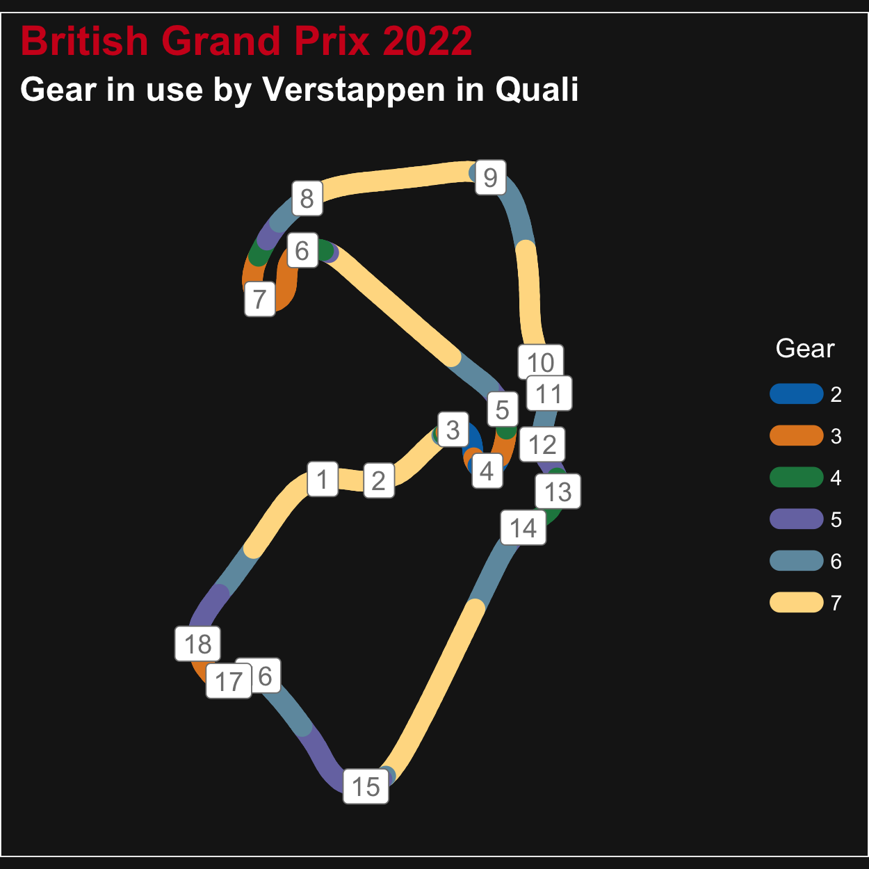
Now we’ll plot it. Look to the bottom of the code to see the addition of labels.
gear_plot <- ggplot(ver, aes(x, y, color = as.factor(n_gear), group = NA)) +
  geom_path(linewidth = 4, lineend = "round") +
  ggplot2::scale_color_manual(
    name = "Gear",
    values = c(
      "1" = "#BC3C29", "2" = "#0072B5", "3" = "#E18727", "4" = "#20854E",
      "5" = "#7876B1", "6" = "#6F99AD", "7" = "#FFDC91", "8" = "#EE4C97"
    ),
    aesthetics = c("color", "fill")
  ) +
  theme_dark_f1() +
  labs(
    title = "British Grand Prix 2022",
    subtitle = "Gear in use by Verstappen in Quali",
    color = "Gear"
  )
labelled_gear_plot <- gear_plot +
  geom_label(data = silverstone_circuit$corners, aes(
    label = paste0(number, letter),
    y = y,
    x = x,
    color = "#9A9A9A"
  ), show.legend = FALSE)

correct_track_ratio(labelled_gear_plot)
Gear selected by Verstappen during his Silverstone fastest qualifying lap
Like before, the plot has some issues with overlap. But this time,
beyond using ggrepel, we have the data provided to move the
labels in a ‘pretty’ way.
The data returned by get_circuit_data() includes an
extra column (angle) that can be used to determine an
adequate shift angle for the label. With that data, and some careful
math, we can move the labels to where we want them.
labelx <- function(x, angle, distance = 750) {
  angle <- angle * pi / 180
  return(cos(angle) * distance + x)
}
labely <- function(y, angle, distance = 750) {
  angle <- angle * pi / 180
  return(sin(angle) * distance + y)
}

silverstone_circuit$corners$labx <- labelx(silverstone_circuit$corners$x, silverstone_circuit$corners$angle)
silverstone_circuit$corners$laby <- labely(silverstone_circuit$corners$y, silverstone_circuit$corners$angle)
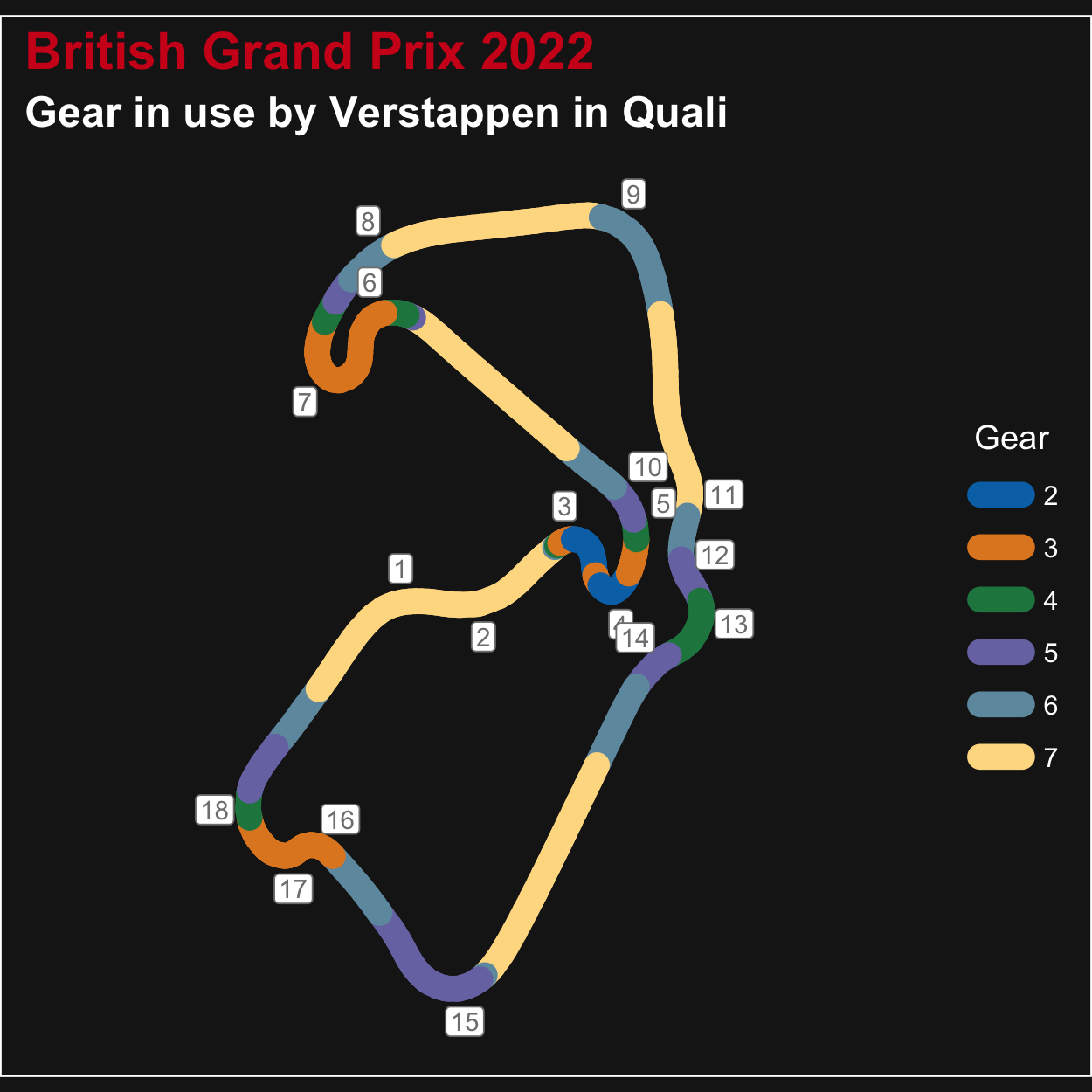
With those new label x and y points calculated, we can re-plot the labels slightly offset from the track.
labelled_gear_plot2 <- gear_plot +
  geom_label(data = silverstone_circuit$corners, aes(
    label = paste0(silverstone_circuit$corners$number, silverstone_circuit$corners$letter),
    y = silverstone_circuit$corners$laby,
    x = silverstone_circuit$corners$labx,
    color = "white",
  ), size = 3, label.padding = unit(0.15, "lines"), show.legend = FALSE)

correct_track_ratio(labelled_gear_plot2)
Plot showing gear in use by Vertappen around Silversone, with corner labels applied
Further exploration (including label repelling) is left to the reader.