Basics
f1dataR serves as a tool to get neatly organized Formula
1 data into your R environment. Here we will go over the basic functions
to understand how the package works.
The most sought-after aspect of F1 data is telemetry data. Let’s get Leclerc’s fastest lap from the first race of 2022:
library(f1dataR)

load_driver_telemetry(2022, 1, "Q", driver = "LEC", laps = "fastest")
#> # A tibble: 697 × 19
#>    date                session_time  time   rpm speed n_gear throttle brake   drs source
#>    <dttm>                     <dbl> <dbl> <dbl> <dbl>  <dbl>    <dbl> <lgl> <dbl> <chr>
#>  1 2022-03-19 15:58:18        4397. 0     10514   292      7      100 FALSE    12 interpolation
#>  2 2022-03-19 15:58:18        4397. 0.084 10502   293      7      100 FALSE    12 pos
#>  3 2022-03-19 15:58:18        4398. 0.152 10478   294      8      100 FALSE    12 car
#>  4 2022-03-19 15:58:18        4398. 0.384 10519   295      8      100 FALSE    12 pos
#>  5 2022-03-19 15:58:18        4398. 0.392 10560   296      8      100 FALSE    12 car
#>  6 2022-03-19 15:58:19        4398. 0.784 10628   297      8      100 FALSE    12 pos
#>  7 2022-03-19 15:58:19        4398. 0.792 10696   299      8      100 FALSE    12 car
#>  8 2022-03-19 15:58:19        4398. 0.952 10696   300      8      100 FALSE    12 car
#>  9 2022-03-19 15:58:19        4398. 1.02  10734   301      8      100 FALSE    12 pos
#> 10 2022-03-19 15:58:19        4399. 1.32  10773   302      8      100 FALSE    12 pos
#> # ℹ 687 more rows
#> # ℹ 9 more variables: relative_distance <dbl>, status <chr>, x <dbl>, y <dbl>, z <dbl>,
#> #   distance <dbl>, driver_ahead <chr>, distance_to_driver_ahead <dbl>, driver_code <chr>
Now let’s use ggplot2 to visualize some of the data we have
library(dplyr)
library(ggplot2)

lec <- load_driver_telemetry(2022, 1, "Q", driver = "LEC", laps = "fastest") %>%
  head(300)

ggplot(lec, aes(distance, throttle)) +
  geom_line() +
  theme_minimal()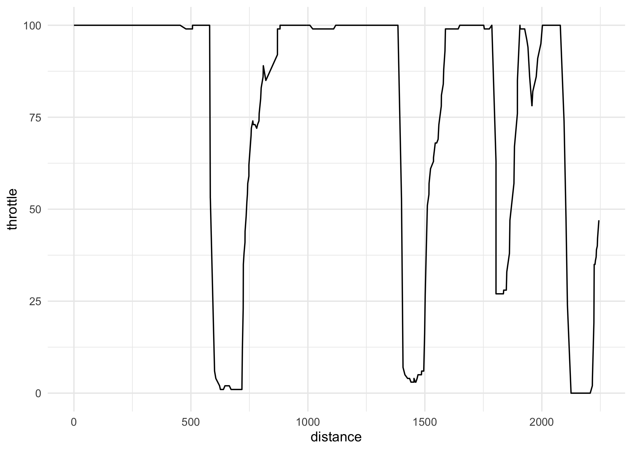
Plot of lap distance vs throttle percentage for Leclerc at the 2022 Bahrain Grand Prix Qualifying session (specifically his fastest lap)
What if we get more drivers involved. Let’s also get the Qualifying data from Hamilton and Pérez
ham <- load_driver_telemetry(2022, 1, "Q", driver = "HAM", laps = "fastest") %>%
  head(300)

per <- load_driver_telemetry(2022, 1, "Q", driver = "PER", laps = "fastest") %>%
  head(300)

data <- bind_rows(lec, ham, per)

ggplot(data, aes(distance, throttle, color = driver_code)) +
  geom_line() +
  theme_minimal()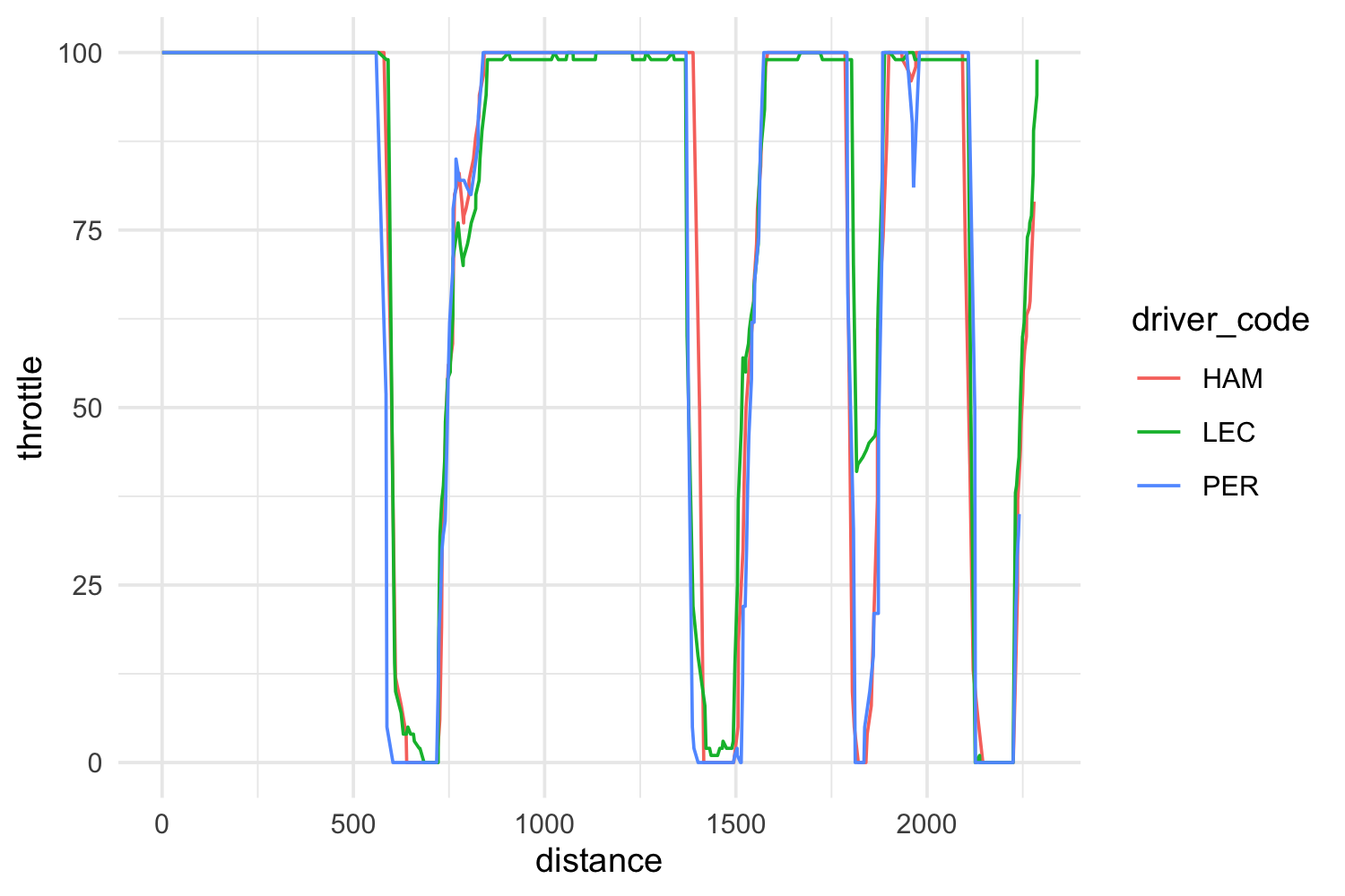
Throttle percent by distance for Leclerc, Hamilton and Perez from 2022 Bahrain Grand Prix Qualifying session
Integrated plotting
There are a couple of functions in the package that help with
plotting. The first one is theme_dark_f1() that simply
applies a theme similar to the official F1 graphics. We can apply it to
our previous data.
ggplot(data, aes(distance, speed, color = driver_code)) +
  geom_line() +
  theme_dark_f1(axis_marks = TRUE) +
  theme(
    axis.title = element_text(),
    axis.line = element_line(color = "white"),
  ) +
  labs(
    title = "Speed Comparison for Bahrain 2022"
  )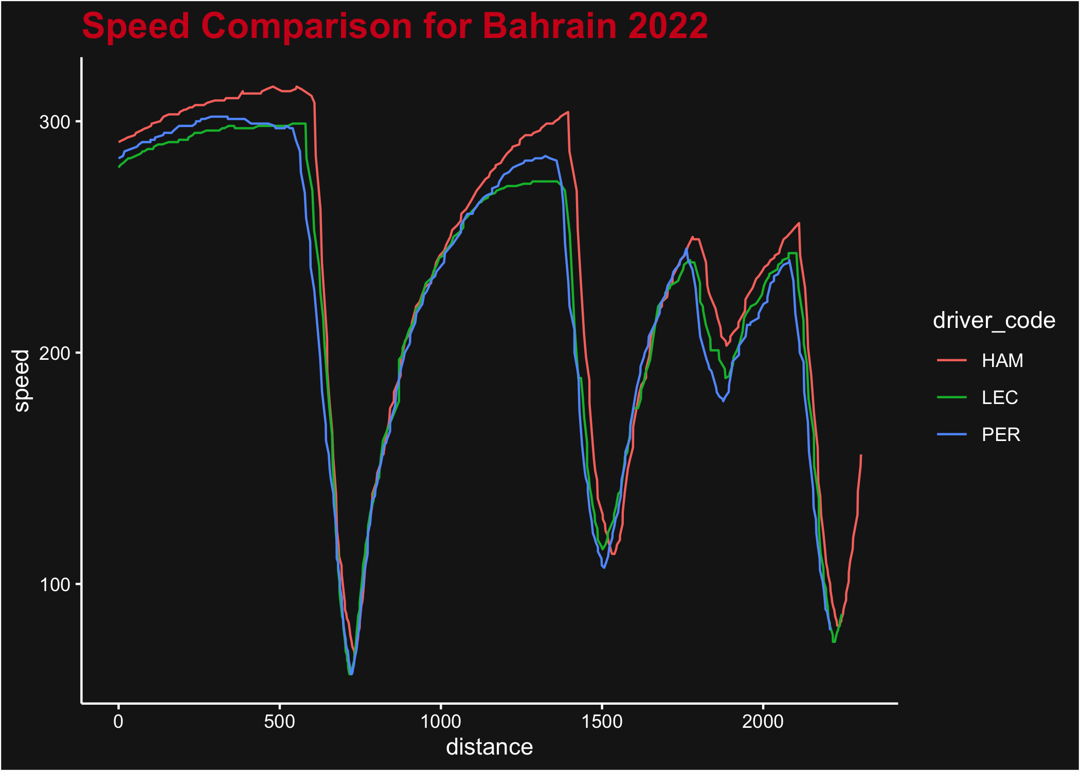
Throttle percent by distance for the three drivers, with f1dataR theme applied
Another built-in function is plot_fastest() that can
plot the speed or gear changes throughout the fastest lap for a
driver/race.
plot_fastest(2022, 1, "R", "PER")
#> ℹ If the session has not been loaded yet, this could take a minute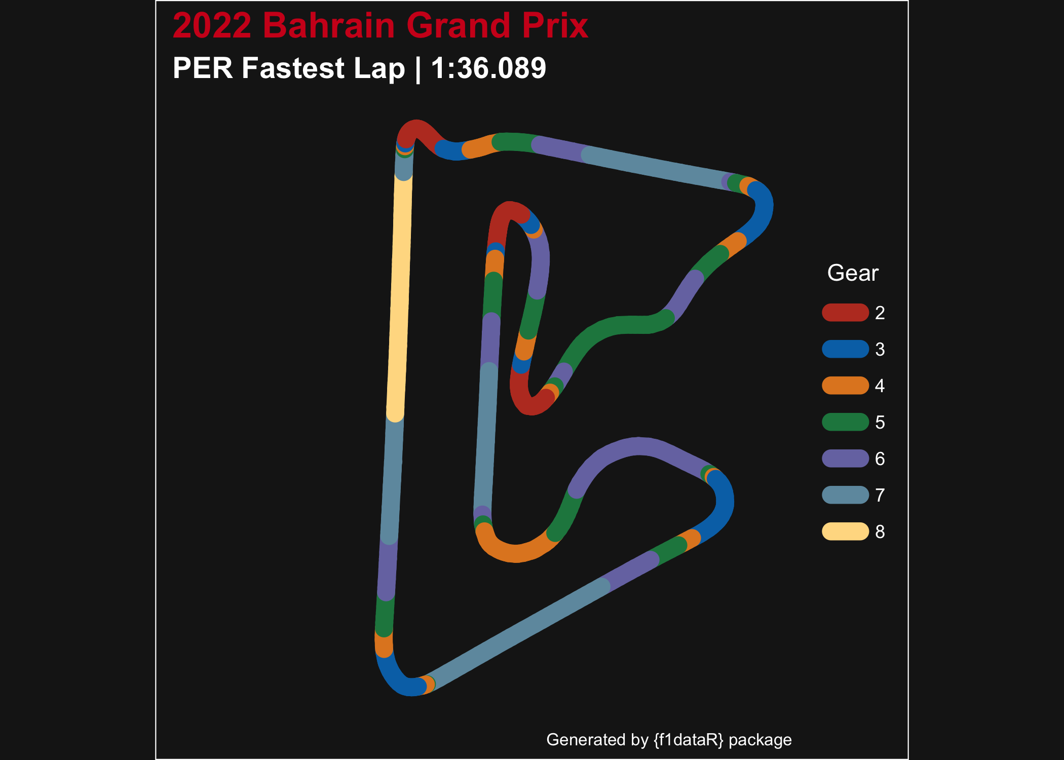
Fastest lap for Perez from the 2022 Bahrain Grand Prix, showing gear used at each point in the lap
Combining several functions
Now let’s look at a more complete analysis. We want to visualize how lap time change over time (tyre age) for Pérez with every compound used in the Spanish GP.
laps <- load_session_laps(2023, "Spain") %>%
  filter(driver == "PER") %>%
  group_by(compound) %>%
  # Remove in and out laps
  filter(tyre_life != 1 & tyre_life != max(tyre_life)) %>%
  ungroup()

ggplot(laps, aes(tyre_life, lap_time, color = compound)) +
  geom_line() +
  geom_point() +
  theme_dark_f1(axis_marks = TRUE) +
  labs(
    color = "Tyre Compound",
    y = "Lap Time (Seconds)",
    x = "Tyre Life (Laps)"
  ) +
  scale_color_manual(
    values = c("white", "yellow", "red")
  ) +
  scale_y_continuous(breaks = seq(75, 85, 1)) +
  scale_x_continuous(breaks = seq(2, 26, 4))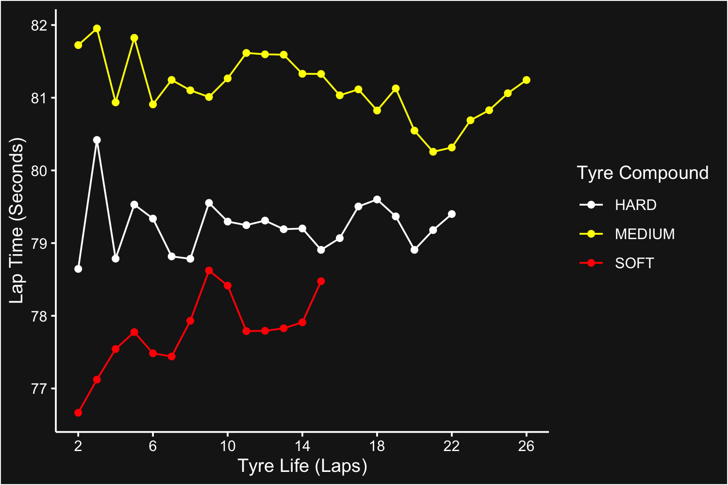
Average laptime per tyre type and age at Spanish Grand Prix 2023
Now let’s visualize the portion of the track where Verstappen had the
throttle 100% open in the 2023 Canadian GP. Note that we’ll pass the
plot through the helper function correct_track_ratio() to
ensure the plotted track has correct dimensions (and a few other tweaks
for pretty plotting). Alternatively, you can call
ggplot2::coord_fixed() while building track plots to ensure
the x & y ratios are equal.
ver_can <- load_driver_telemetry(
  season = 2023,
  round = "Canada",
  driver = "VER",
  laps = "fastest"
) %>%
  mutate(open_throttle = ifelse(throttle == 100, "Yes", "No"))

throttle_plot <- ggplot(ver_can, aes(x, y, color = as.factor(open_throttle), group = NA)) +
  geom_path(linewidth = 4, lineend = "round") +
  scale_color_manual(values = c("white", "red")) +
  theme_dark_f1() +
  labs(
    title = "Verstappen Flat Out",
    subtitle = "Canada 2023 | Fastest Lap",
    color = "Throttle 100%"
  )

correct_track_ratio(throttle_plot)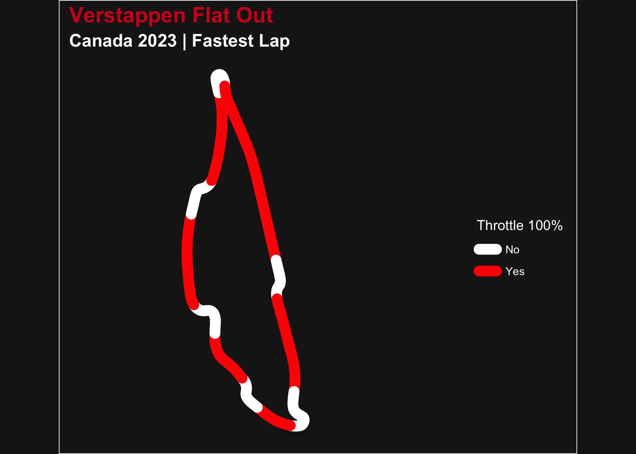
Verstappen fastest lab in the Canadian Grand Prix 2023, showing full throttle sections
For a simpler visualization let’s look at the average time it took each team to pit in round 4 of 2023. For this we will have to load the pit data, the results data (to extract driver + team combos), and read the constructor data to get the colors for our plot. Note the time is the difference from pit entry to exit, not stopped time.
pit_data <- load_pitstops(2023, 4)

driver_team <- load_results(2023, 4) %>%
  select(driver_id, constructor_id)

pit_constructor <- pit_data %>%
  left_join(driver_team, by = "driver_id") %>%
  group_by(constructor_id) %>%
  summarise(pit_time = mean(as.numeric(duration)))

pit_constructor$constructor_color <- sapply(pit_constructor$constructor_id, get_team_color, season = 2023, round = 4, USE.NAMES = FALSE)

pit_constructor$team_name <- sapply(pit_constructor$constructor_id, get_team_name, season = 2023, short = TRUE, USE.NAMES = FALSE)

ggplot(pit_constructor, aes(x = team_name, y = pit_time, fill = team_name)) +
  geom_bar(stat = "identity", fill = pit_constructor$constructor_color) +
  theme_dark_f1(axis_marks = TRUE) +
  theme(
    legend.position = "none"
  ) +
  labs(
    x = "Constructor",
    y = "Average Pit Time (seconds)"
  ) +
  ggtitle("Average time in pit lane for each team", subtitle = "Azerbaijan Grand Prix 2023")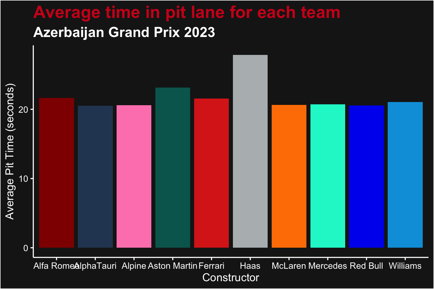
Average time in pits for each team at the 2023 Azerbaijan Grand Prix